Design Your Website To Be Responsive
Starting last year and going into the next few years, Google is rolling out its new policy of Mobile-First-Indexing. Since Google is the company that determines our survival on the internet, it would make sense to follow their lead when it comes to designing our websites. This Mobile-First-Indexing is a change that Google made in response to the huge amount of mobile devices on the internet. Mobile devices, phones, and tablets comprise more than half of all internet usage. So, moving forward, Google will be ranking your site on how your mobile site performs. If there is a difference between your mobile site and your desktop site, Google will defer to the mobile site. And if you don't have a mobile site, and the site you do have does not work well on mobile devices, Google will penalize you and downgrade your ranking in its index. All this is to say that you need to make sure that your site is mobile-ready. Make sure that your site works great on a smartphone as well as on a desktop without a lot of scrolling or resizing.
Additionally, a well-designed website that works well on desktops and cellphones will increase conversion rates. Your visitors we'll have a more enjoyable experience and will stay longer. Visitors that stay longer on websites are more likely to go farther down the sales funnel, which ends in higher conversion rates. If your visitors run into frustrations with navigation or difficult to read websites, they will move on to another website. After all, there is an unlimited number of websites from which they can choose.
CHECK YOUR DESIGNS ON DIFFERENT DEVICES
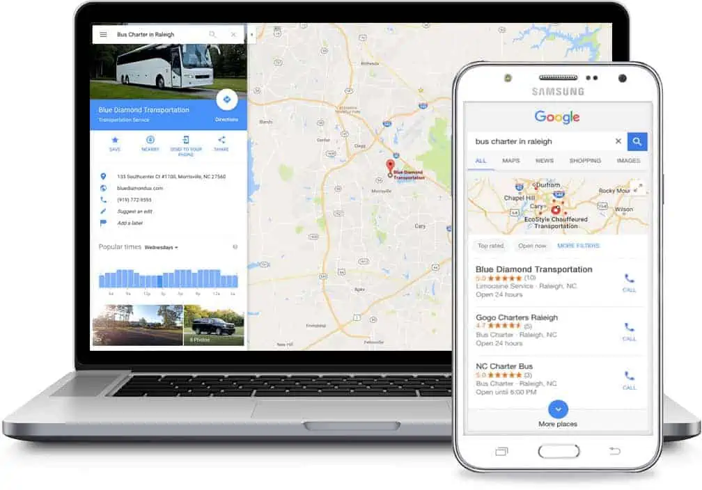
A good way to make sure that you remain in Google's good graces and continue to rank high on its search result pages is to make sure that your website is responsive. Responsive web design allows a web page to automatically adapt to whatever screen it is on at the time. So, if it's on a computer, it should easily use the entire real estate with the graphic elements and the text for easy viewing. But when it's on a cell phone, it must be just as easy to access all the information, images, and menus. And even if you load the website onto a tablet, the content will readjust to accommodate the mid-size footprint of a tablet. One thing that's important to note is that Google will not penalize cellphone websites for hiding unnecessary titles and headlines. This policy is because they recognize that fitting all that information on a small screen is frequently impossible.
DESIGNERS and DEVELOPERS WORK TOGETHER
The challenges to creating a design that works on a screen that's two inches wide just as well as it works on a screen that is 18 in wide are significant. These development efforts are going to require significant cooperation between the designers and the developers of websites. Gone are the days when a designer can sketch out an entire site and hand it off to the developer and forget about it. If you are in the process of designing or reworking your website to comply with Google's Mobile-First-Indexing approach, allow me to make a few suggestions that might help you in your website design process.
PLAN TWICE - DESIGN ONCE
The challenge for artistic designers in any industry is reigning in their creativity to meet with the harsh realities of the engineer's world. In the case of website development, the engineers are the web developers, and Google has handed them a strict rule book that is sometimes difficult to follow. My suggestion is for your first step, sit down, and discuss your ideas and concepts to the head of the development team. The development team will be in charge of turning your ideas into reality, so it's a good idea to clear out any obvious design obstacles before they get started. This discussion is key to discovering and eliminating problems before they bite you in the behind.
At this initial meeting, it is probably a good idea to establish workflow processes and communication and collaboration procedures. Good feedback procedures and frequent communications will be important in keeping the workflow moving, and it will help steer clear of any issues.
"FOCUS GROUP" YOUR WEBSITE IDEAS
When you come up with a web design feature that gives your web developers pause, consider making a workable prototype for that website feature and testing it on a focus group. Based on their feedback, you can decide the importance of this website feature, and you can compare it to the difficulty of implementation. If it is a critical feature, you will need to work with the development team to make it a reality. If it's not possible to implement your design idea, it's better to know this at the beginning of the process rather than later on when other parts of the website are in place.
CELL PHONES ARE KIND OF SMALL
Some computer screens are enormous, and some cell phone screens are tiny. Since you know this when you are going into the design phase, you should be prepared for the challenges ahead. One thing you need to remember is that Google has already told us that mobile devices take precedence. Mobile-First-Indexing is the law of the land. If one of the two devices needs to suffer, let it be the desktop version of your website.
Another thing to keep in mind is that one of the criteria that Google uses to rank websites on how fast they load - graphics and all. Some graphic content is outside of the designers' control, such as content that is provided by partners or clients. But for the most part, you as the designer, will have control over the size and resolution of most of the graphical elements.
Probably the smallest screen you will have to accommodate is an iPhone SE. The horizontal display on this phone is 320 pixels. When you are in the design process, remember this value because it will make all of your pages look great on most mobile and desktop devices.
RESPONSIVE WEBSITES RULE
Having a responsive website that automatically adjusts to the device of your visitor is the approach that is strongly recommended by Google. The other option is to have two different versions of your website - one for mobile and one for the desktop. The most common CMS platforms will allow you to develop a responsive site that will automatically adjust to the size of the device. If you are using Wordpress as your design platform, check to make sure that the theme you are using is a responsive theme. Most WordPress themes are responsive themes. Once you have reworked your website within the parameters of the responsive theme, you can check how it looks with our Mobile Friendly Analysis Tool and on Google's Mobile-Friendly Test tool.
PROFESSIONAL HELP IS HERE
Here at The Click Depot, we have made thousands of responsive themes, and we can work with you to develop a professional website. Call one of our website development consultants to learn what we can do for you.
Most article:
Sign up for our Newsletter
Receive important updates delivered right to your email.


